Component Styleguide
A showcase of all components used on the homepage
Design Principles
Clean & Minimal
Vercel-inspired design: simple, professional, focused on content.
Light Backgrounds
Use white, light gray, and subtle gray gradients. No dark hero sections.
Monochromatic
Prefer black, white, and grays. Use colors sparingly for accents only.
No Gradient Blobs
Avoid colorful gradient backgrounds, glow orbs, or flashy effects.
Subtle Shadows
Use soft shadows and borders instead of heavy drop shadows.
Consistent Spacing
Use 8px grid system. Common values: 0.5rem, 1rem, 1.5rem, 2rem, 3rem.
Color Palette
Gray Scale
#fafafa#f5f5f5#e5e5e5#d4d4d4#a3a3a3#737373#525252#404040#262626#171717#000000Semantic Colors
#10b981#ef4444#f59e0b#3b82f6Section Backgrounds
#ffffff#fafafalinear-gradient(180deg, #fafafa, #ffffff)Typography
We use Google Sans Flex as our primary font for a modern, clean appearance.
Build Something Amazing
font-size: 4rem; font-weight: 800; letter-spacing: -0.02emSection Heading
font-size: 2.5rem; font-weight: 700; letter-spacing: -0.02emCard Heading
font-size: 1.5rem; font-weight: 600This is standard body text used for paragraphs and general content. It should be readable and comfortable for longer passages of text.
font-size: 1rem; line-height: 1.6; color: #525252Section Label
font-size: 0.75rem; font-weight: 600; text-transform: uppercase; letter-spacing: 0.05emtext-wrap: balance on headings to prevent awkward line breaks. Use non-breaking hyphen (‑) for compound words like E‑Commerce.Code Block Component
Syntax-highlighted code blocks with optional typing animation. Uses Catppuccin Mocha color scheme.
Static Code Block
import { startPlatform } from '@unchainedshop/platform';

const engine = await startPlatform({
  modules: {
    products: true,
    orders: true,
  },
});

// Your commerce API is ready!
console.log('GraphQL:', engine.graphqlPath);
Animated Code Block
export default {
  theme: {
    extend: {
      colors: {
        brand: '#your-color',
      }
    }
  }
}- Keywords (
import,const):#cba6f7(purple) - Strings:
#a6e3a1(green) - Functions:
#89b4fa(blue) - Properties:
#fab387(orange) - Comments:
#6c7086(gray italic)
Copilot Chat Preview
Animated AI chat interface showing market expansion workflow. Used in homepage and copilot page heroes.
- User message types in with animation
- AI response fades in
- Checklist items appear one by one
- Check icons pop in with scale animation
- Success message appears at the end
Terminal Component
Code and terminal display for developer-focused content.
- Background:
#1a1a1a - Prompt ($):
#10b981(green) - Command:
#ffffff(white) - Highlight:
#60a5fa(blue)
Copyable Code Component
Inline command with copy-to-clipboard functionality. Used for quick-start commands.
npm init @unchainedshopnpx @unchainedshop/create-storefront my-shopPills & Labels
CTA Pills
Label with Dot
Developer Label
Integrated Commerce Suite
A fully integrated suite of commerce and payment products
Everything you need to build and scale your digital commerce platform
Unchained Core
GraphQL Engine
Products
Catalog & Inventory
Orders
Processing & Fulfillment
Payments
Multi-gateway Support
Users
Auth & Accounts
Analytics
Insights & Reporting
Delivery
Shipping & Logistics
Notifications
Email & Push
Animated Deploy Flow
Deploy in Under 120 Seconds
Watch how fast you can go from zero to production
Click Deploy
One-click deployment to Railway
Configure
Auto-configured environment variables
Build & Deploy
Automatic build and deployment
Live!
Your store is ready
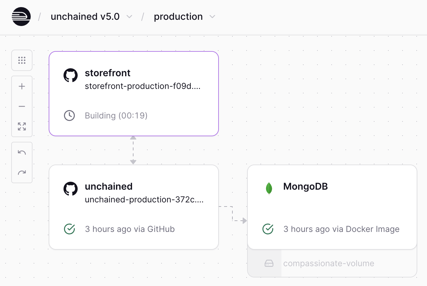
Railway Deployment Architecture
Live Deployment Infrastructure
Watch your services deploy and connect in real-time
Announcement Bar
Hero Headline
Build commerce faster with our headless e‑commerce engine
Button System (Used in Project)
Two Button Styles
Primary: Dark background (#111827) with lighter hover (#374151)
Secondary: White background with light grey hover (#f3f4f6)
Sizes
States
Form Actions
Special Elements
npm installFeature Cards (Use Blue Links)
Performance Feature
Lorem ipsum dolor sit amet, consectetur adipiscing elit. Sed do eiusmod tempor incididunt ut labore.
Learn MoreTemplate Feature
Ut enim ad minim veniam, quis nostrud exercitation ullamco laboris nisi ut aliquip ex ea commodo.
Learn MoreScalability Feature
Duis aute irure dolor in reprehenderit in voluptate velit esse cillum dolore eu fugiat nulla.
Learn MoreCards use simple blue links (card-link class) instead of button styling
Feature Primary Cards
Launch in Minutes
Deploy your complete e‑commerce solution with our one-click deployment system.
Tech Stack Cards

Node.js Backend
Powerful server-side JavaScript runtime for building scalable network applications.
GraphQL API
Flexible query language for your API that gives clients exactly what they need.

MongoDB Database
Document-based NoSQL database that scales horizontally across commodity servers.
Feature Tags
Code Snippet
npx create-unchained-app my-storeSuccess Story Logos


Template Navigation
Template Highlights
Lightning Fast
Optimized for performance and Core Web Vitals
Fully Customizable
Tailwind CSS components you can easily modify
Mobile First
Responsive design that works on every device
Admin UI Features
Analytics Dashboard
Comprehensive insights into your business performance
Performance Optimized
Fast and responsive interface for all your admin tasks
Customizable Interface
Adapt the admin panel to match your workflow needs
Ticketing Features
CTA Features Grid
Feature Benefits List
- Complete e‑commerce platform out of the box
- Headless architecture for maximum flexibility
- GraphQL API for efficient data fetching
- Built-in payment and shipping integrations
- Scalable microservices architecture